 By Michelle Howe
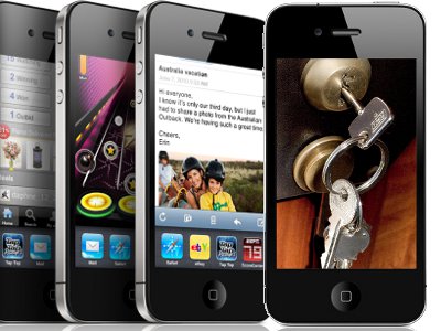
YNOT – How does your website look on a handheld device? Is it easy to navigate? Is the most important information readily available to your visitors? Is your website mobile-web-ready?
Ten years ago, most small business owners didn’t have a website and probably didn’t see the need for one. Now, a business without a website is considered second-rate, at best. A website is a necessity for doing business in the 21st Century. Also a necessity in the 21st Century is a website that can be viewed easily on a handheld device.
iPhones, BlackBerries, Windows Mobile-based smartphones and the iPad all have changed the way people consume online information. In the next few years, the popularity of surfing the net on a mobile device, already popular in Europe, is going to skyrocket in the U.S. Just as mobile phones revolutionized voice communication, handheld internet connections are changing the web.
However, even though improvements in technology make it easier for users to connect to the internet wherever and whenever they please, one big hurdle remains for mobile devices: Small screens make for difficult viewing.
Although most handhelds are web-enabled these days, most websites look terrible on mobile devices. Unfortunately, shrinking a site to fit on a smaller screen usually leads to difficulty viewing and finding information. Smart business owners ensure their sites are designed to be viewed easily on both desktops and mobiles.
Here are some pointers for making your website mobile-ready:
Don’t use Flash. The screen is too small, and Flash content is just plain annoying. Besides, mobile browsers don’t support Flash.
Get a dot-mobi extension for your website. Available since September 2006, more than 500,000 dot-mobi domains have been registered. Most major registrars offer dot-mobi registration, and many of the ones who do also offer mobile-specific site-building tools.
Use easy-to-read fonts. Verdana and Arial may be the best font faces for the mobile web because they are “clean” and uncomplicated. The contract between black type and a white background makes for easier viewing. White type on a black background also is high in contrast, but the combination promotes eye strain.
Keep it vertical. On many mobile devices, it’s much easier to move up and down than it is to move side to side. Mobile screens are becoming better about automatically “flipping” from vertical to horizontal orientation when the user rotates the device, but it’s still a good idea to ensure the first thing a viewer sees on your site is attractive and complete. Your content needs to be presented so the most important information occurs at the top of the page.
Keep user connection costs down. Unfortunately, surfing the mobile web still incurs sky-high data rates on some networks, so users are looking for information and entertainment that is quick to arrive. Help them out by employing informative headlines, subheadings and bulleted lists. Don’t make them go deeper into your website to find answers. Also, consider offering a choice between image and video formats so those with slow or expensive connections can enjoy the view without paying through the nose.
Design for simplicity. The smaller the screen, the more difficult it is to read, so you may need to re-concept the overall look of your website for delivery via the mobile web. A graphics-dominant site may not be the best choice, at least for the homepage and tour pages. Streamline the look of your website and concentrate on the message. Zero in on the specific information your customers need and give it to them.
You won’t get a second chance to make a first impression. On a regular website, users can move around quickly and easily with the Back and Forward buttons on their browsers or by scrolling their mice. Navigation is trickier—and often slower—on handheld devices. Users will abandon mobile sites that require too much effort. Make sure your navigation system is intuitive and get it right the first time, because more and more options similar to yours are appearing daily.
Conclusion
Making your content available on the mobile web may mean tweaking your current design or building something entirely new just for the mobile space. Each business owner needs to evaluate the situation and make choices depending on what he or she want to accomplish. However you approach mobility, you must embrace it. The internet is moving off the desktop and into the hands of your customers. You can’t wait any longer to join the revolution.
Michelle Howe, MBA, is president of Internet Word Magic, which specializes in writing copy for websites. Visit her website for a free chapter of her e-book, Turn Browsers into Buyers: Secrets for Turning an Internet Profit. This article originally appeared at MainstreamWebmasters.com. It was revised and reprinted with permission.


